Function for plotting the development of cross-sectional entropies across
sequence positions with ggplot2 (Wickham 2016)
instead of base R's plot function that is used by
TraMineR::seqplot (Gabadinho et al. 2011)
.
Other than in TraMineR::seqHtplot group-specific entropy
lines are displayed in a common plot.
Usage
ggseqeplot(
  seqdata,
  group = NULL,
  weighted = TRUE,
  with.missing = FALSE,
  linewidth = 1,
  linecolor = "Okabe-Ito",
  gr.linetype = FALSE
)
Arguments
- seqdata
State sequence object (class
stslist) created with theTraMineR::seqdeffunction.- group
If grouping variable is specified plot shows one line for each group
- weighted
Controls if weights (specified in
TraMineR::seqdef) should be used. Default isTRUE, i.e. if available weights are used- with.missing
Specifies if missing states should be considered when computing the entropy index (default is
FALSE).- linewidth
Specifies the with of the entropy line; default is
1- linecolor
Specifies color palette for line(s); default is
"Okabe-Ito"which contains up to 9 colors (first is black). if more than 9 lines should be rendered, user has to specify an alternative color palette- gr.linetype
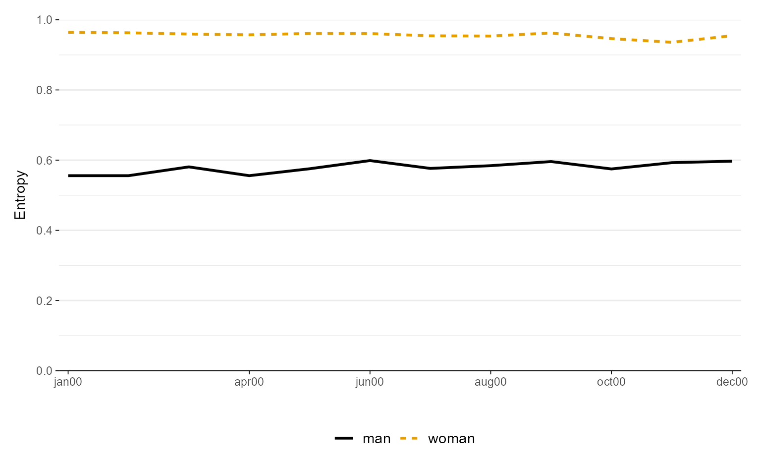
Specifies if line type should vary by group; hence only relevant if group argument is specified; default is
FALSE
Value
A line plot of entropy values at each sequence position. If stored as object the resulting list object also contains the data (long format) used for rendering the plot.
Details
The function uses TraMineR::seqstatd
to compute entropies. This requires that the input data (seqdata)
are stored as state sequence object (class stslist) created with the
TraMineR::seqdef function.
The entropy values are plotted with geom_line. The data
and specifications used for rendering the plot can be obtained by storing the
plot as an object. The appearance of the plot can be adjusted just like with
every other ggplot (e.g., by changing the theme or the scale using + and
the respective functions).
References
Gabadinho A, Ritschard G, Müller NS, Studer M (2011).
“Analyzing and Visualizing State Sequences in R with TraMineR.”
Journal of Statistical Software, 40(4), 1–37.
doi:10.18637/jss.v040.i04
.
Wickham H (2016).
ggplot2: Elegant Graphics for Data Analysis, Use R!, 2nd ed. edition.
Springer, Cham.
doi:10.1007/978-3-319-24277-4
.
Examples
library(TraMineR)
# Use example data from TraMineR: actcal data set
data(actcal)
# We use only a sample of 300 cases
set.seed(1)
actcal <- actcal[sample(nrow(actcal), 300), ]
actcal.lab <- c("> 37 hours", "19-36 hours", "1-18 hours", "no work")
actcal.seq <- seqdef(actcal, 13:24, labels = actcal.lab)
#> [>] 4 distinct states appear in the data:
#> 1 = A
#> 2 = B
#> 3 = C
#> 4 = D
#> [>] state coding:
#> [alphabet] [label] [long label]
#> 1 A A > 37 hours
#> 2 B B 19-36 hours
#> 3 C C 1-18 hours
#> 4 D D no work
#> [>] 300 sequences in the data set
#> [>] min/max sequence length: 12/12
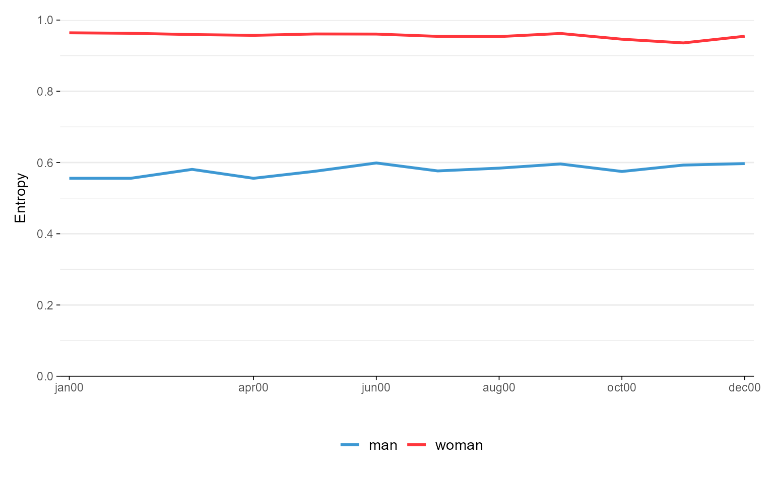
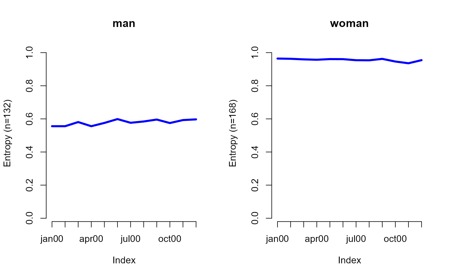
# sequences sorted by age in 2000 and grouped by sex
# with TraMineR::seqplot (entropies shown in two separate plots)
seqHtplot(actcal.seq, group = actcal$sex)
 # with ggseqplot (entropies shown in one plot)
ggseqeplot(actcal.seq, group = actcal$sex)
# with ggseqplot (entropies shown in one plot)
ggseqeplot(actcal.seq, group = actcal$sex)
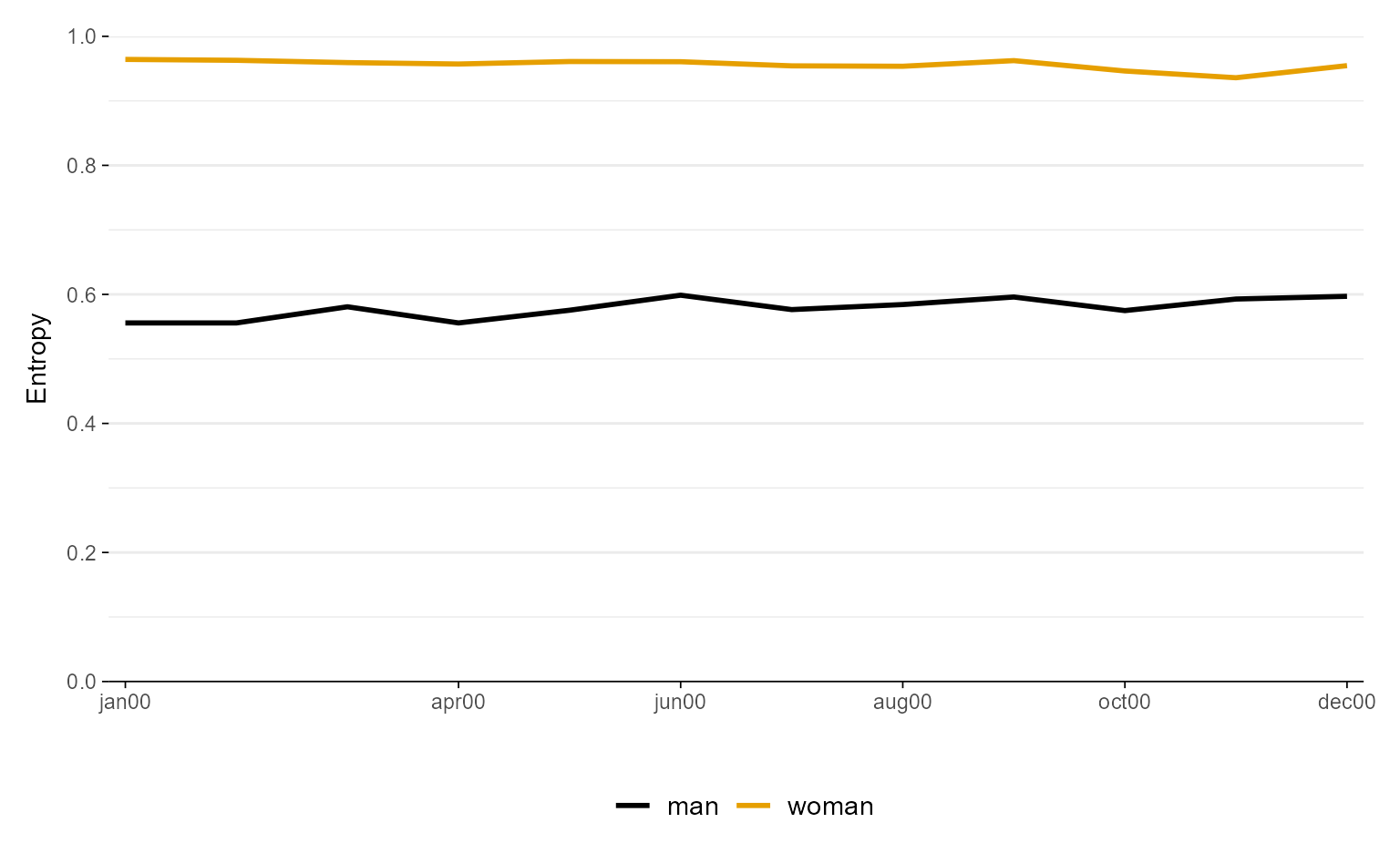 ggseqeplot(actcal.seq, group = actcal$sex, gr.linetype = TRUE)
 # manual color specification
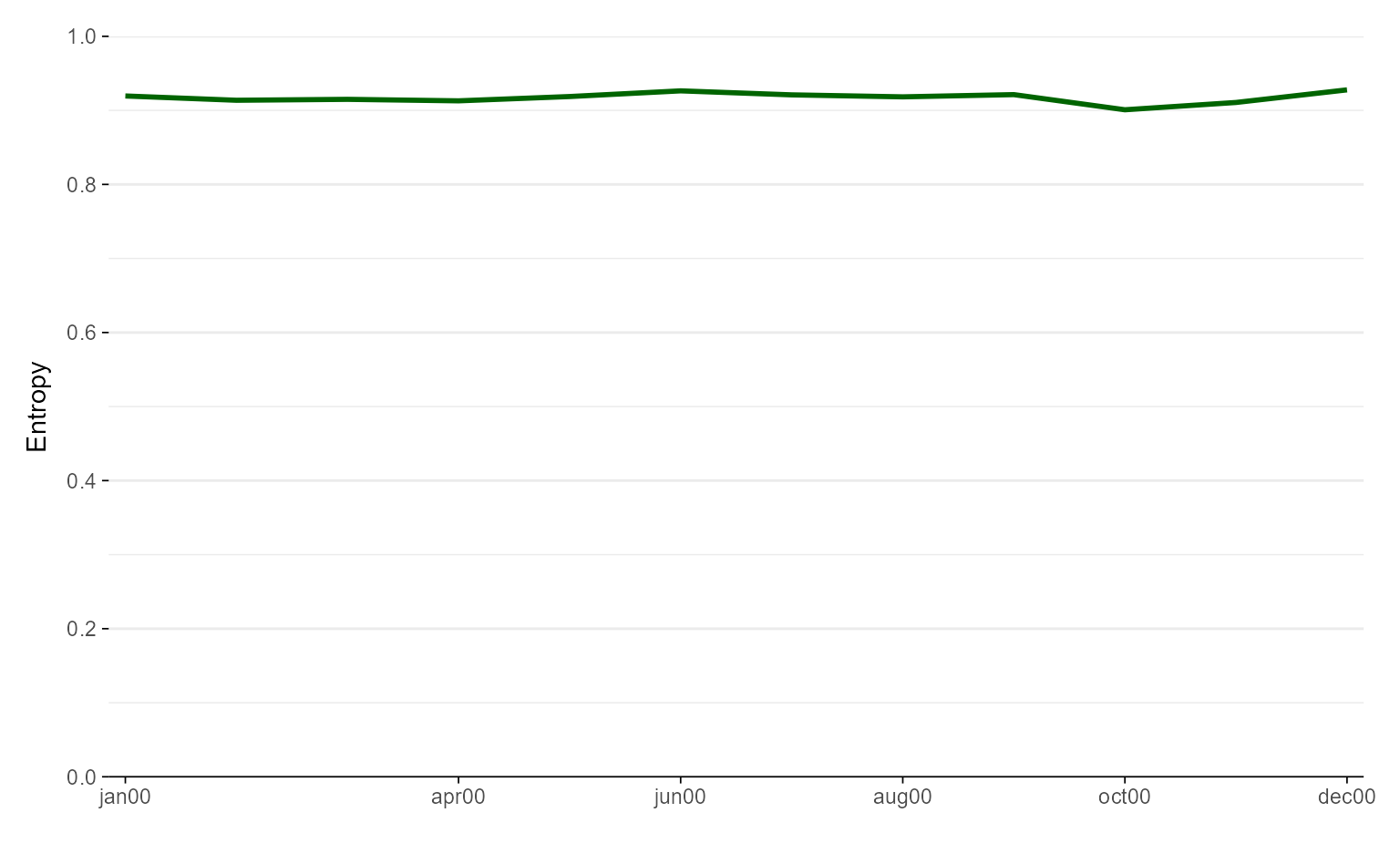
ggseqeplot(actcal.seq, linecolor = "darkgreen")
# manual color specification
ggseqeplot(actcal.seq, linecolor = "darkgreen")
 ggseqeplot(actcal.seq, group = actcal$sex,
linecolor = c("#3D98D3FF", "#FF363CFF"))
ggseqeplot(actcal.seq, group = actcal$sex,
linecolor = c("#3D98D3FF", "#FF363CFF"))