Function for rendering state distribution plots with ggplot2
(Wickham 2016)
instead of base R's plot
function that is used by TraMineR::seqplot
(Gabadinho et al. 2011)
.
Usage
ggseqdplot(
  seqdata,
  no.n = FALSE,
  group = NULL,
  dissect = NULL,
  weighted = TRUE,
  with.missing = FALSE,
  border = FALSE,
  with.entropy = FALSE,
  linetype = "dashed",
  linecolor = "black",
  linewidth = 1,
  facet_ncol = NULL,
  facet_nrow = NULL,
  ...
)
Arguments
- seqdata
State sequence object (class
stslist) created with theTraMineR::seqdeffunction.- no.n
specifies if number of (weighted) sequences is shown (default is
TRUE)- group
A vector of the same length as the sequence data indicating group membership. When not NULL, a distinct plot is generated for each level of group.
- dissect
if
"row"or"col"are specified separate distribution plots instead of a stacked plot are displayed;"row"and"col"display the distributions in one row or one column respectively; default isNULL- weighted
Controls if weights (specified in
TraMineR::seqdef) should be used. Default isTRUE, i.e. if available weights are used- with.missing
Specifies if missing states should be considered when computing the state distributions (default is
FALSE).- border
if
TRUEbars are plotted with black outline; default isFALSE(also acceptsNULL)- with.entropy
add line plot of cross-sectional entropies at each sequence position
- linetype
The linetype for the entropy subplot (
with.entropy==TRUE) can be specified with an integer (0-6) or name (0 = blank, 1 = solid, 2 = dashed, 3 = dotted, 4 = dotdash, 5 = longdash, 6 = twodash); ; default is"dashed"- linecolor
Specifies the color of the entropy line if
with.entropy==TRUE; default is"black"- linewidth
Specifies the width of the entropy line if
with.entropy==TRUE; default is1- facet_ncol
Number of columns in faceted (i.e. grouped) plot
- facet_nrow
Number of rows in faceted (i.e. grouped) plot
- ...
if group is specified additional arguments of
ggplot2::facet_wrapsuch as"labeller"or"strip.position"can be used to change the appearance of the plot. Does not work ifdissectis used
Value
A sequence distribution plot created by using ggplot2.
If stored as object the resulting list object (of class gg and ggplot) also
contains the data used for rendering the plot.
Details
Sequence distribution plots visualize the distribution of all states
by rendering a series of stacked bar charts at each position of the sequence.
Although this type of plot has been used in the life course studies for several
decades (see Blossfeld (1987)
for an early application),
it should be noted that the size of the different bars in stacked bar charts
might be difficult to compare - particularly if the alphabet comprises many
states (Wilke 2019)
. This issue can be addressed by breaking down
the aggregated distribution specifying the dissect argument. Moreover, it
is important to keep in mind that this plot type does not visualize individual
trajectories; instead it displays aggregated distributional information
(repeated cross-sections). For a more detailed discussion of this type of
sequence visualization see, for example, Brzinsky-Fay (2014)
,
Fasang and Liao (2014)
, and Raab and Struffolino (2022)
.
The function uses TraMineR::seqstatd to obtain state
distributions (and entropy values). This requires that the input data (seqdata)
are stored as state sequence object (class stslist) created with
the TraMineR::seqdef function. The state distributions
are reshaped into a a long data format to enable plotting with ggplot2.
The stacked bars are rendered by calling geom_bar; if entropy = TRUE
entropy values are plotted with geom_line. If the group or the
dissect argument are specified the sub-plots are produced by using
facet_wrap. If both are specified the plots are rendered with
facet_grid.
The data and specifications used for rendering the plot can be obtained by storing the
plot as an object. The appearance of the plot can be adjusted just like with
every other ggplot (e.g., by changing the theme or the scale using + and
the respective functions).
References
Blossfeld H (1987).
“Labor-Market Entry and the Sexual Segregation of Careers in the Federal Republic of Germany.”
American Journal of Sociology, 93(1), 89–118.
doi:10.1086/228707
.
Brzinsky-Fay C (2014).
“Graphical Representation of Transitions and Sequences.”
In Blanchard P, Bühlmann F, Gauthier J (eds.), Advances in Sequence Analysis: Theory, Method, Applications, Life Course Research and Social Policies, 265–284.
Springer, Cham.
doi:10.1007/978-3-319-04969-4_14
.
Fasang AE, Liao TF (2014).
“Visualizing Sequences in the Social Sciences: Relative Frequency Sequence Plots.”
Sociological Methods & Research, 43(4), 643–676.
doi:10.1177/0049124113506563
.
Gabadinho A, Ritschard G, Müller NS, Studer M (2011).
“Analyzing and Visualizing State Sequences in R with TraMineR.”
Journal of Statistical Software, 40(4), 1–37.
doi:10.18637/jss.v040.i04
.
Raab M, Struffolino E (2022).
Sequence Analysis, volume 190 of Quantitative Applications in the Social Sciences.
SAGE, Thousand Oaks, CA.
https://sa-book.github.io/.
Wickham H (2016).
ggplot2: Elegant Graphics for Data Analysis, Use R!, 2nd ed. edition.
Springer, Cham.
doi:10.1007/978-3-319-24277-4
.
Wilke C (2019).
Fundamentals of Data Visualization: A Primer on Making Informative and Compelling Figures.
O'Reilly Media, Sebastopol, CA.
ISBN 978-1-4920-3108-6.
Examples
library(TraMineR)
#>
#> TraMineR stable version 2.2-12 (Built: 2025-06-30)
#> Website: http://traminer.unige.ch
#> Please type 'citation("TraMineR")' for citation information.
library(ggplot2)
# Use example data from TraMineR: actcal data set
data(actcal)
# We use only a sample of 300 cases
set.seed(1)
actcal <- actcal[sample(nrow(actcal), 300), ]
actcal.lab <- c("> 37 hours", "19-36 hours", "1-18 hours", "no work")
actcal.seq <- seqdef(actcal, 13:24, labels = actcal.lab)
#> [>] 4 distinct states appear in the data:
#> 1 = A
#> 2 = B
#> 3 = C
#> 4 = D
#> [>] state coding:
#> [alphabet] [label] [long label]
#> 1 A A > 37 hours
#> 2 B B 19-36 hours
#> 3 C C 1-18 hours
#> 4 D D no work
#> [>] 300 sequences in the data set
#> [>] min/max sequence length: 12/12
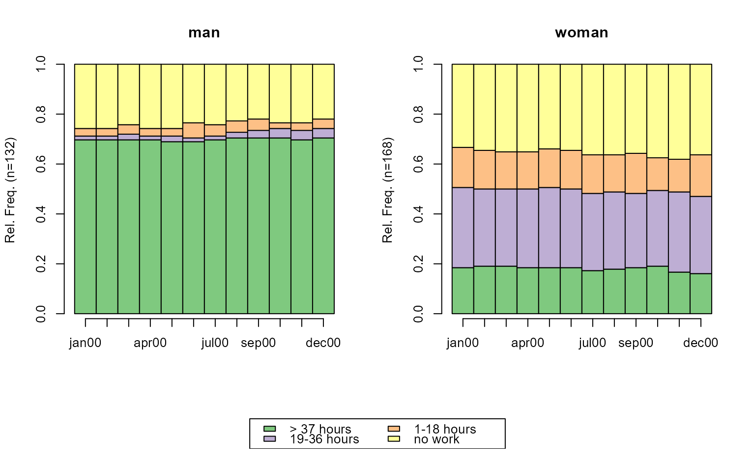
# state distribution plots; grouped by sex
# with TraMineR::seqplot
seqdplot(actcal.seq, group = actcal$sex)
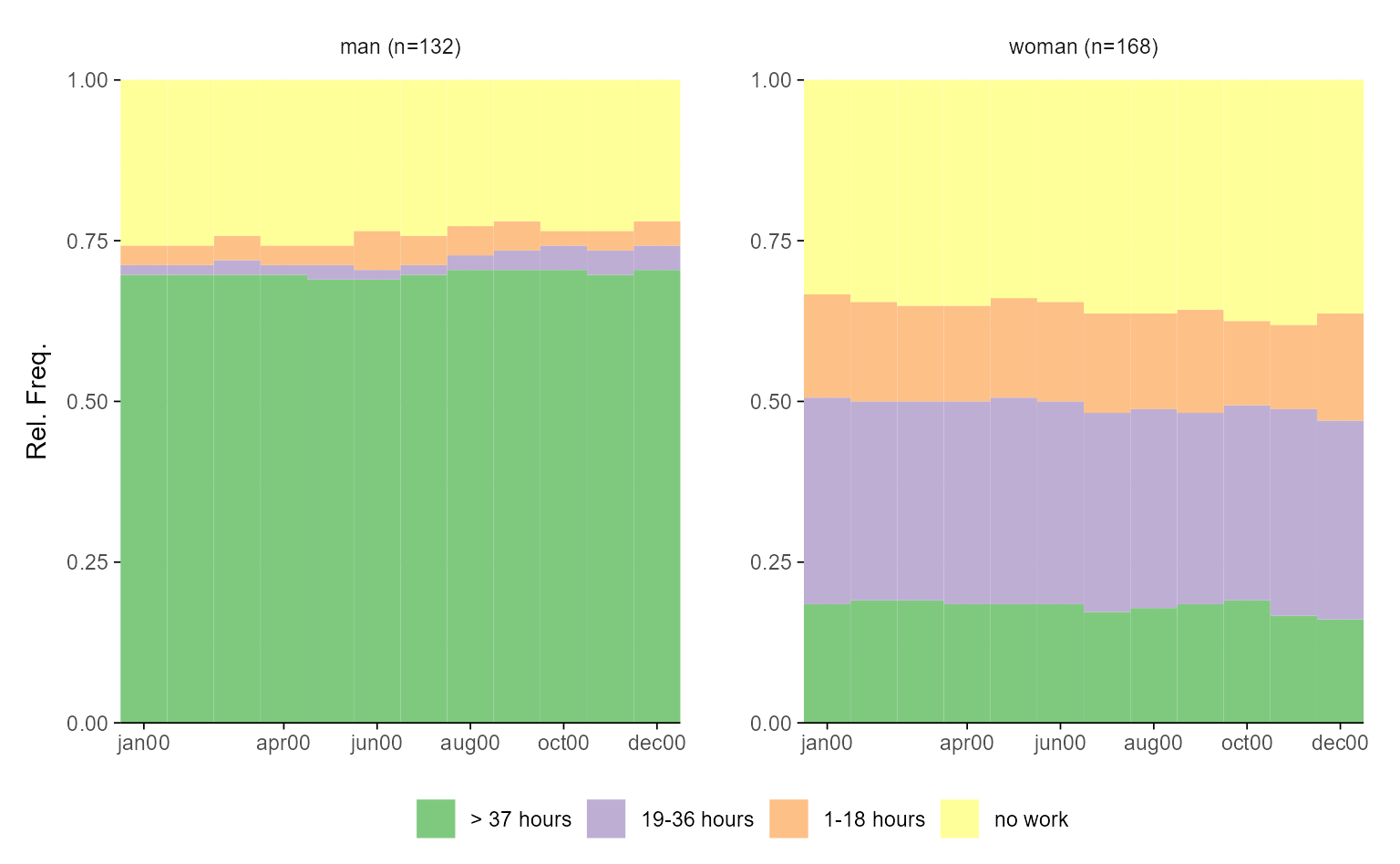
 # with ggseqplot
ggseqdplot(actcal.seq, group = actcal$sex)
# with ggseqplot
ggseqdplot(actcal.seq, group = actcal$sex)
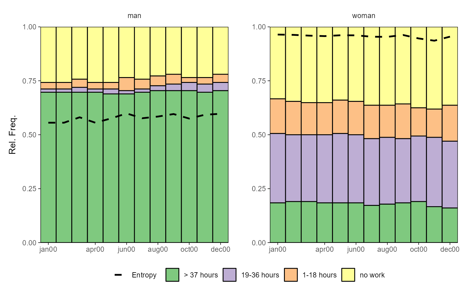
 # with ggseqplot applying a few additional arguments, e.g. entropy line
ggseqdplot(actcal.seq, group = actcal$sex,
no.n = TRUE, with.entropy = TRUE, border = TRUE)
# with ggseqplot applying a few additional arguments, e.g. entropy line
ggseqdplot(actcal.seq, group = actcal$sex,
no.n = TRUE, with.entropy = TRUE, border = TRUE)
 # break down the stacked plot to ease comparisons of distributions
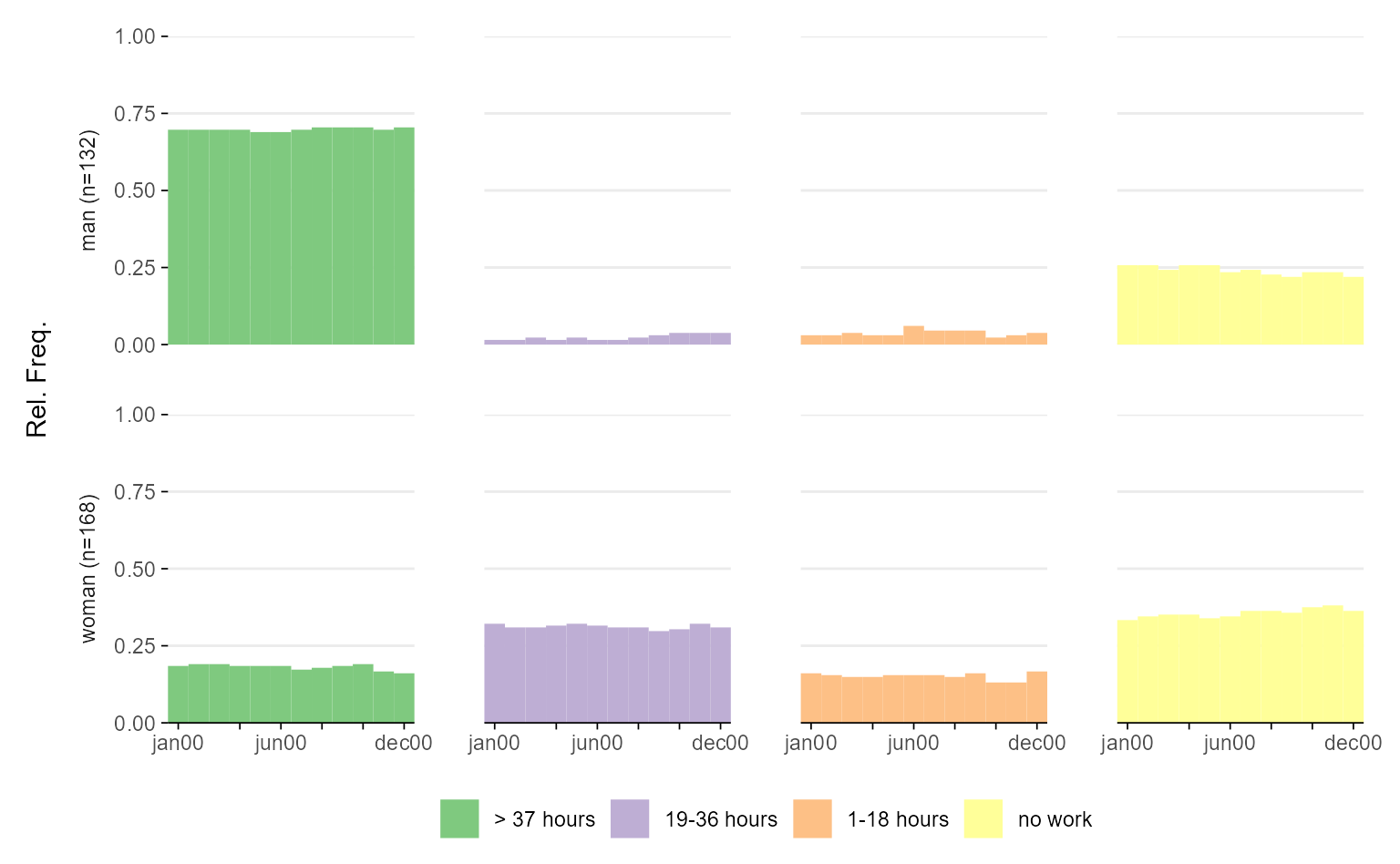
ggseqdplot(actcal.seq, group = actcal$sex, dissect = "row")
# break down the stacked plot to ease comparisons of distributions
ggseqdplot(actcal.seq, group = actcal$sex, dissect = "row")
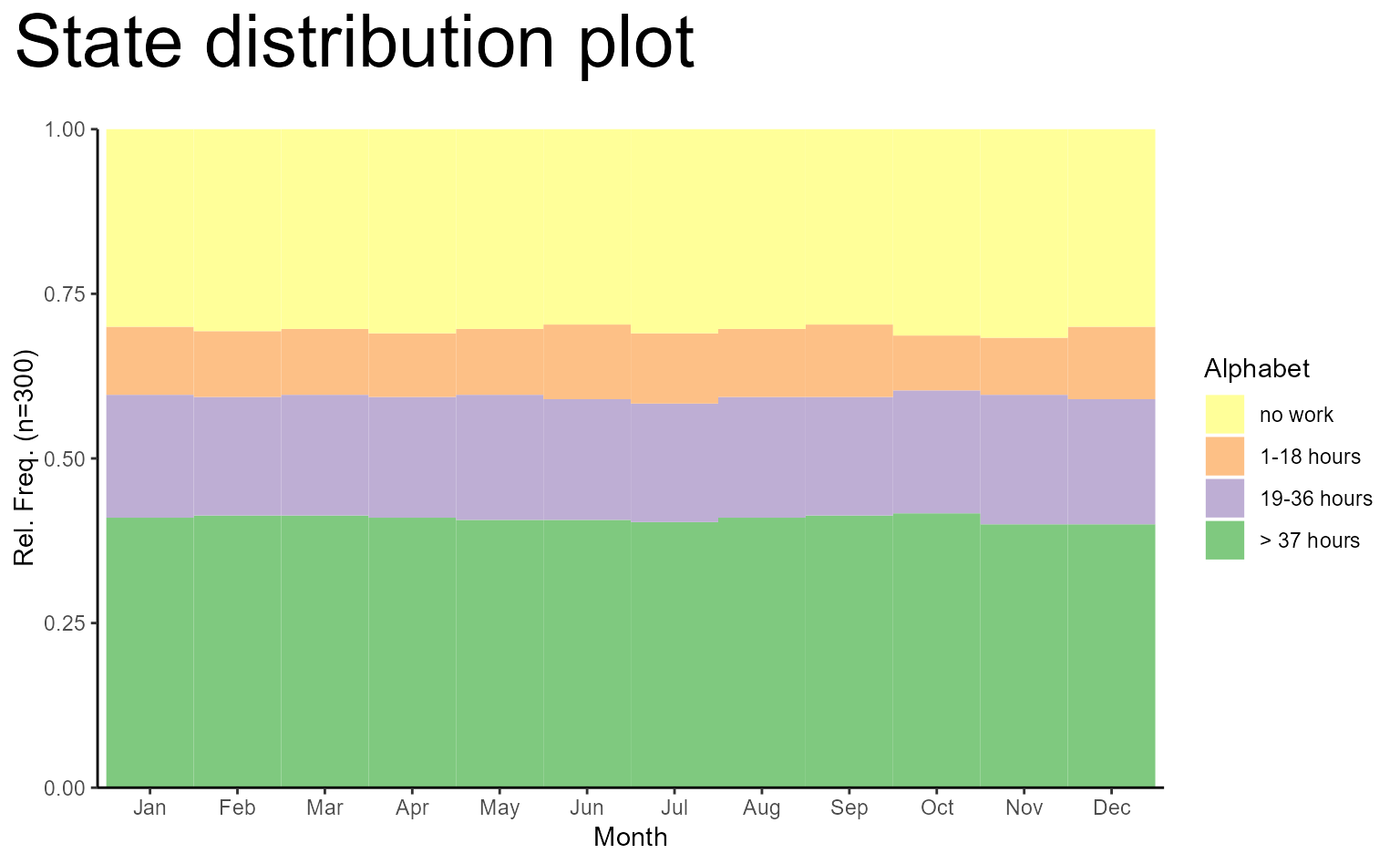
 # make use of ggplot functions for modifying the plot
ggseqdplot(actcal.seq) +
scale_x_discrete(labels = month.abb) +
labs(title = "State distribution plot", x = "Month") +
guides(fill = guide_legend(title = "Alphabet")) +
theme_classic() +
theme(plot.title = element_text(size = 30,
margin = margin(0, 0, 20, 0)),
plot.title.position = "plot")
#> Scale for x is already present.
#> Adding another scale for x, which will replace the existing scale.
# make use of ggplot functions for modifying the plot
ggseqdplot(actcal.seq) +
scale_x_discrete(labels = month.abb) +
labs(title = "State distribution plot", x = "Month") +
guides(fill = guide_legend(title = "Alphabet")) +
theme_classic() +
theme(plot.title = element_text(size = 30,
margin = margin(0, 0, 20, 0)),
plot.title.position = "plot")
#> Scale for x is already present.
#> Adding another scale for x, which will replace the existing scale.